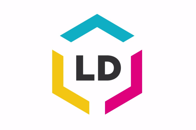
Online office supply retailer LD Products has introduced a new company logo and package design. The new look was first announced at the company wide “All Hands” meeting earlier this year before quietly making its way onto packaging and the company’s website in recent months. A website redesign that fully incorporates the new logo is expected to follow early next year. Visit http://www.ldproducts.com/logo for a behind the scenes look on the creation of their new logo.
“After sixteen years with the same logo, it was time for a fresh look,” says Aaron Leon, CEO/Founder of LD Products. “We knew we wanted a simpler, more contemporary design that exemplified the continued growth of the business.”
LD Products’ in-house design team found inspiration in well-regarded brands like Apple® and Nike®, eventually settling on a logo centered around four major pillars:
- Heritage: Preserving the history of the original logo was an influential creative decision. By combining key identifiers – the hexagons from the original logo, company colors and LD initials – the design team created a look that still remained true to the company’s roots.
- Product: LD brand ink and toner supplies have been a respected alternative solution to original brand cartridges for over a decade. The company is very proud of its product and it was important this was represented in the new logo. This was achieved by breaking apart the hexagonal design so it fit neatly around the LD initials, forming the shape of a box around its product.
- Expansion: LD Products continues to grow at a rapid pace and they are on track to ship over 10 million ink, toner and ribbon cartridges this year. The logo’s hexagonal design also represents the growth of the business, illustrated by the three arrows that point outward.
- Focus: The LD initials are intentionally centered in the middle of the logo, representing the company’s focus and dedication to the future. The goals of the company, its customers, employees and business partners all play a symbiotic role in the continued success of the brand and business.
“This was a complex project that required translating our history into something modern and exciting,” says Fred Machuca, Creative Director of LD Products.
Mr. Machuca, a veteran creative with over ten years’ executive experience in brand and web design for companies like Skechers®, Harman/Kardon® and KIA®, knew the logo redesign was something meaningful the moment it crossed his desk: “This was a dream project for any creative team to be a part of and I’m extremely proud of the work our design team produced.”
There is always something exciting happening at LD Products. More announcements will be coming soon, including a brand new responsive website redesign.
