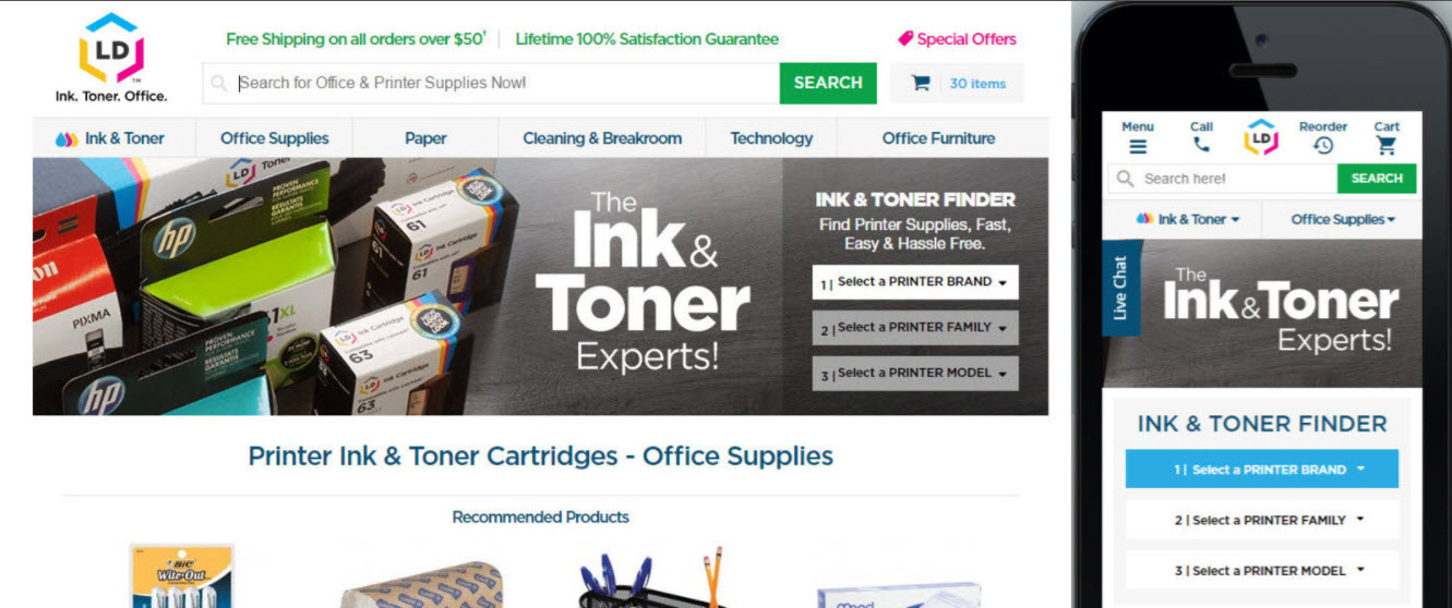
If you have shopped on LDProducts.com recently, you might have noticed things are looking a little bit different. Late last week we launched a mobile responsive version of our website.
For those not familiar with the term, a mobile responsive design means the website is mobile friendly and will adjust accordingly to your preferred device. So whether you are shopping on a desktop computer, a tablet or mobile phone, the site will adapt to that specific device, providing you with the best possible shopping experience. That means less scrolling, easier navigation and a faster checkout. Mobile-friendly sites are essential for any online business these days, with more than half of all web traffic coming from smartphones and tablets, customers choose to shop in many different ways. By offering an optimized mobile experience to our customers, we are providing a better way to shop for your home or office on a range of devices.
We are excited we are finally able to share our mobile responsive website with our customers. If you haven’t had a chance to check out the newly optimized site, take a look. For more information on our responsive redesign, read the press release here.
